industrial monochrome, architectural precision, matte black (slide 1 of 7)
industrial monochrome, architectural precision, matte black (slide 2 of 7)
industrial monochrome, architectural precision, matte black (slide 3 of 7)
industrial monochrome, architectural precision, matte black (slide 4 of 7)
industrial monochrome, architectural precision, matte black (slide 5 of 7)
industrial monochrome, architectural precision, matte black (slide 6 of 7)
1 / 7

Spotted in the wild

@thebrandidentity

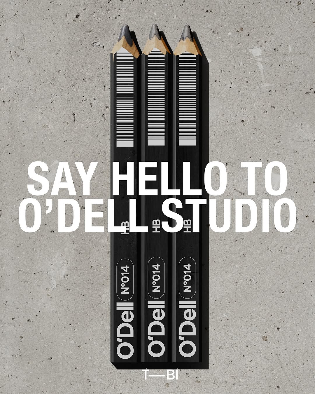
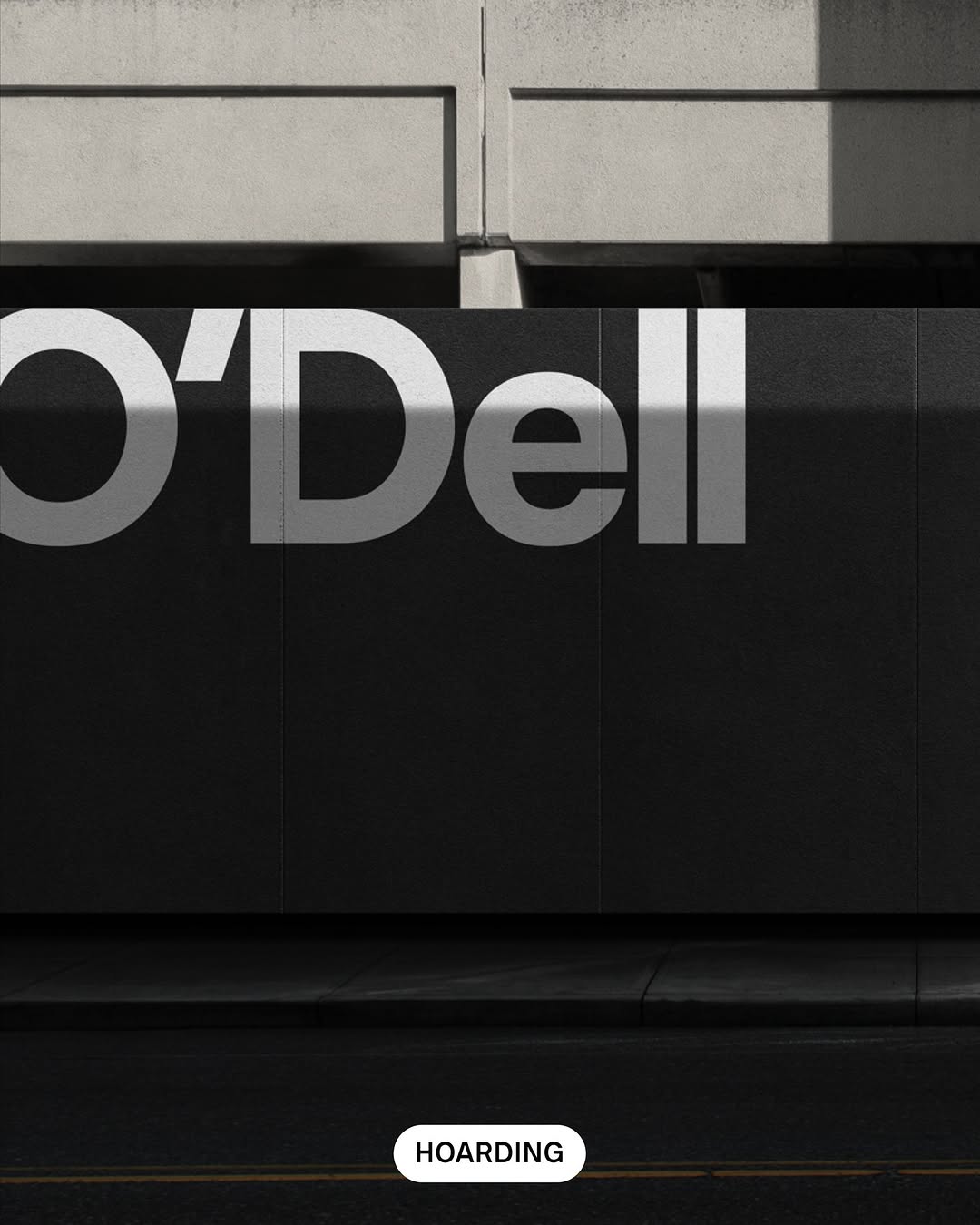
#utility-as-aestheticindustrial monochrome, architectural precision, matte black

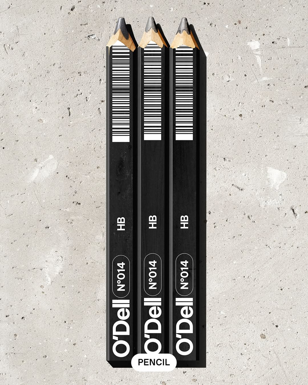
Positioning a creative studio as a precision practice happens instantly when you treat mandatory retail elements like barcodes as deliberate graphic features. By starkly contrasting white ink on a matte black barrel and adding archival batch numbers, they signal absolute control over the final output.
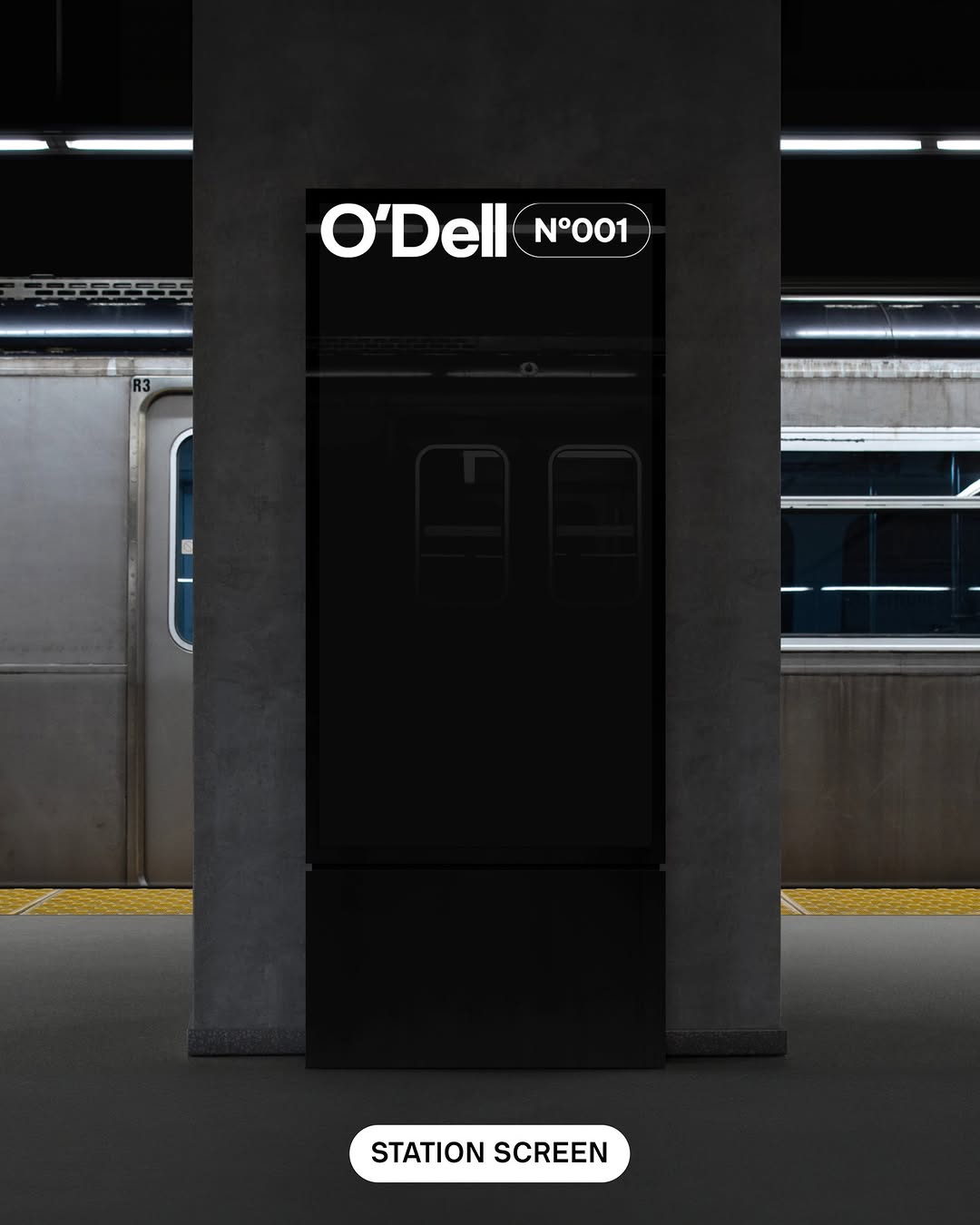
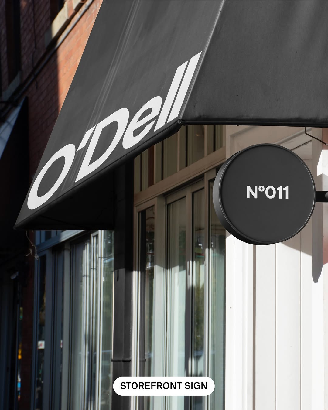
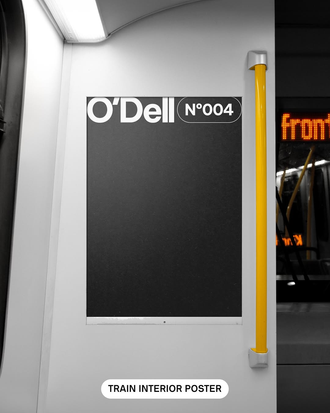
The portable idea

Taking ownership of the ugliest parts of a product canvas is a pure confidence play. Instead of hiding mandatory details like barcodes or batch numbers, scale them up and make them the hero of a high-contrast layout. It tells your audience that you do not just design the fun parts, you engineer the whole object.

May 20, 2026spotted via @thebrandidentity

Steal this for your brand world

Findie's translation of the move above into specific Sense2 products by industry. Pick the row that fits your brief — pricing is per piece at minimum order quantity.

Three more from the studio

More moments worth a look.

Want something like these?

Ask Findie for a quick conversation, or hand the brief to Susan and the team. Either works.