Brand crush
@uncocostudio
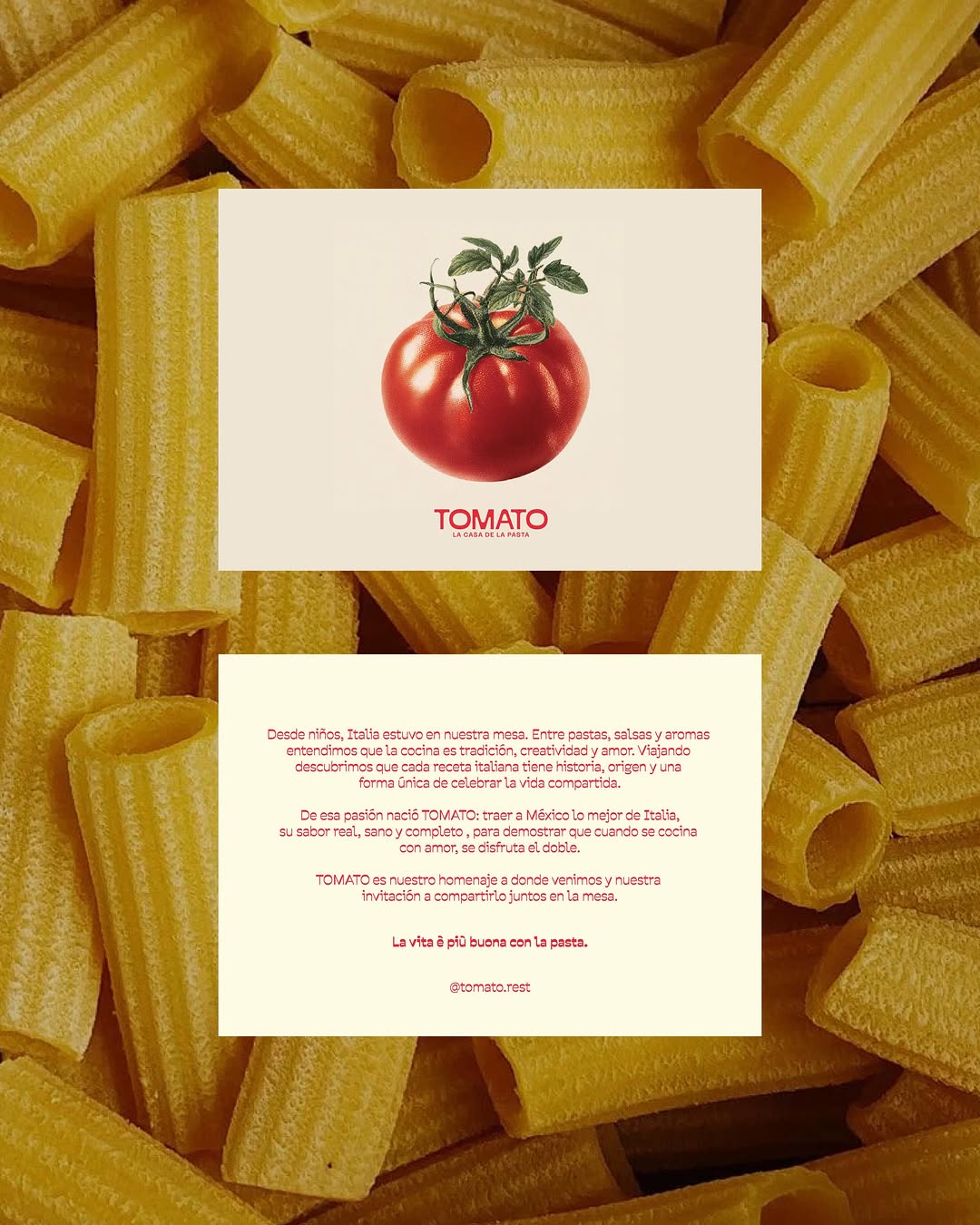
#raw-material-as-canvasvisceral minimalism, raw texture, confident typography
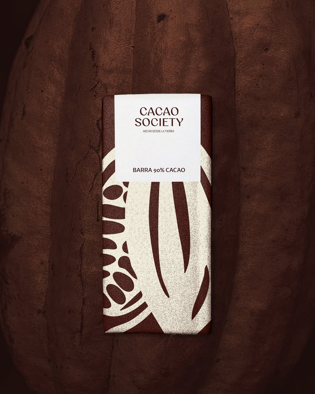
Stripping away the packaging to lay a quiet, generously tracked wordmark directly over a hyper-textured macro shot is a deliberate trust play. It signals absolute confidence in the raw material, forcing the viewer's brain to process the sensory weight of the product before it even registers the brand name.
The portable idea
When you have a product this textural, the strongest strategic move is to get out of its way. Dropping a highly disciplined, soft-serif wordmark over a macro crop of your core ingredient shifts the positioning from manufactured good to pure substance. It proves you do not need elaborate packaging structures to hold a premium price point in a crowded market.
May 21, 2026spotted via @uncocostudio