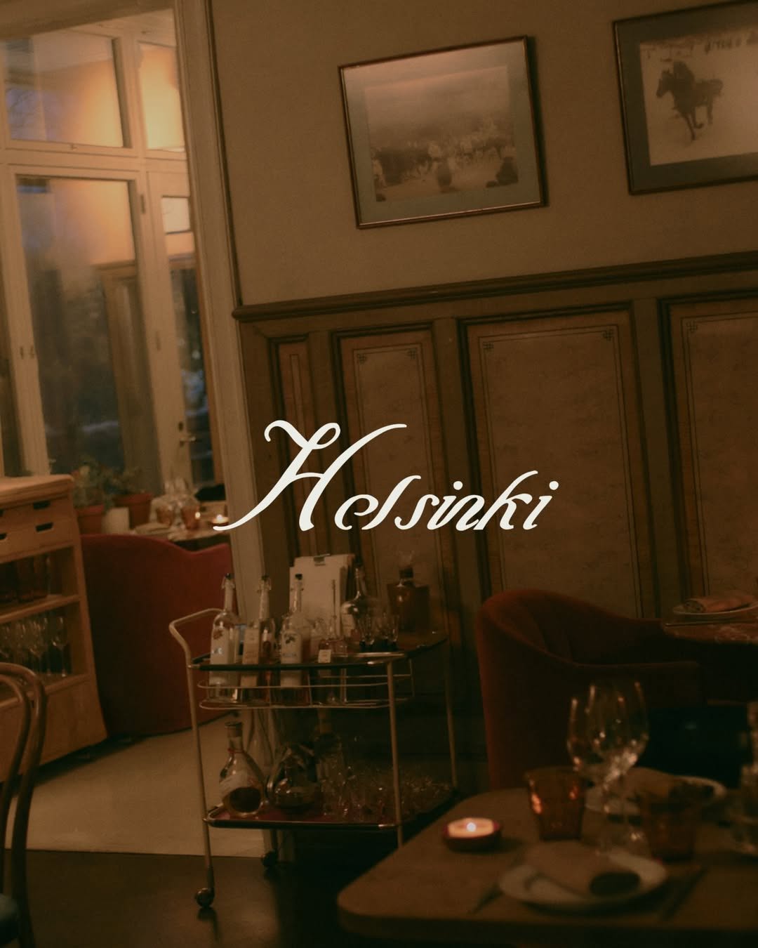
Brand crush
welovebranding
Identity by @welovebranding
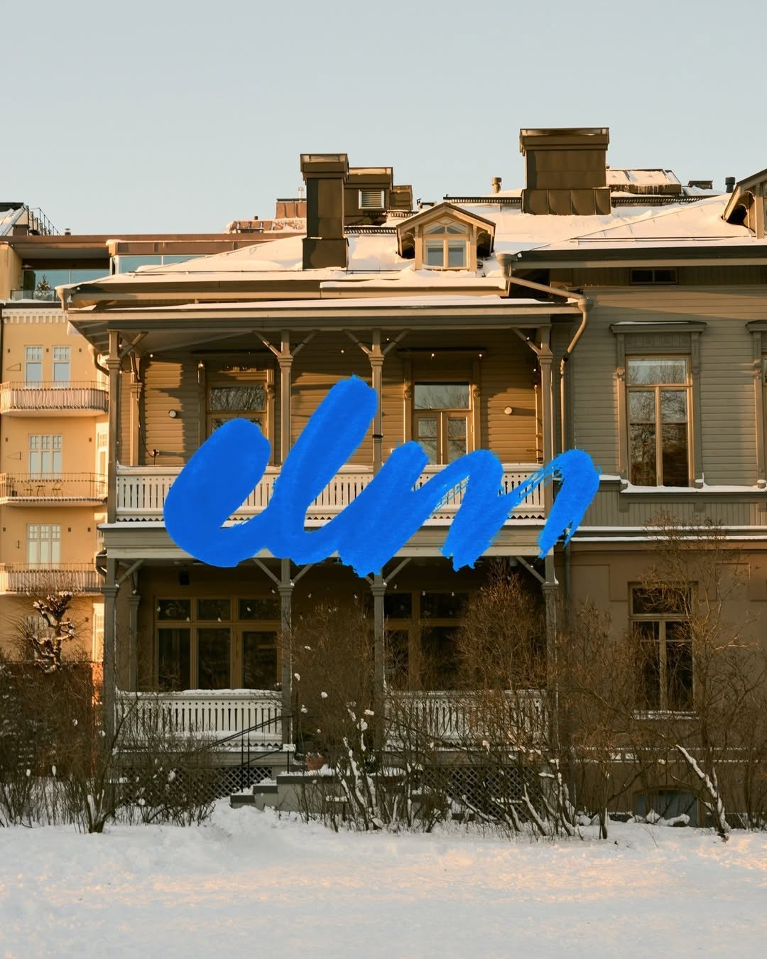
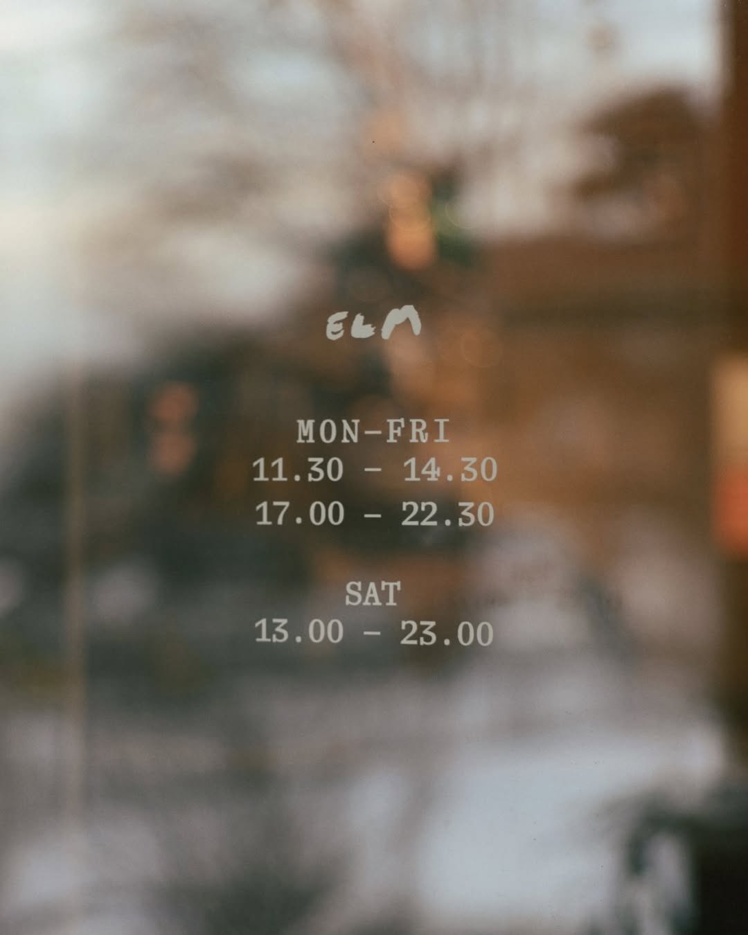
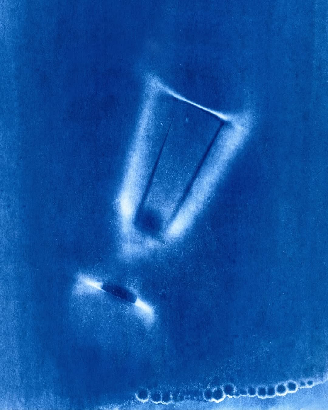
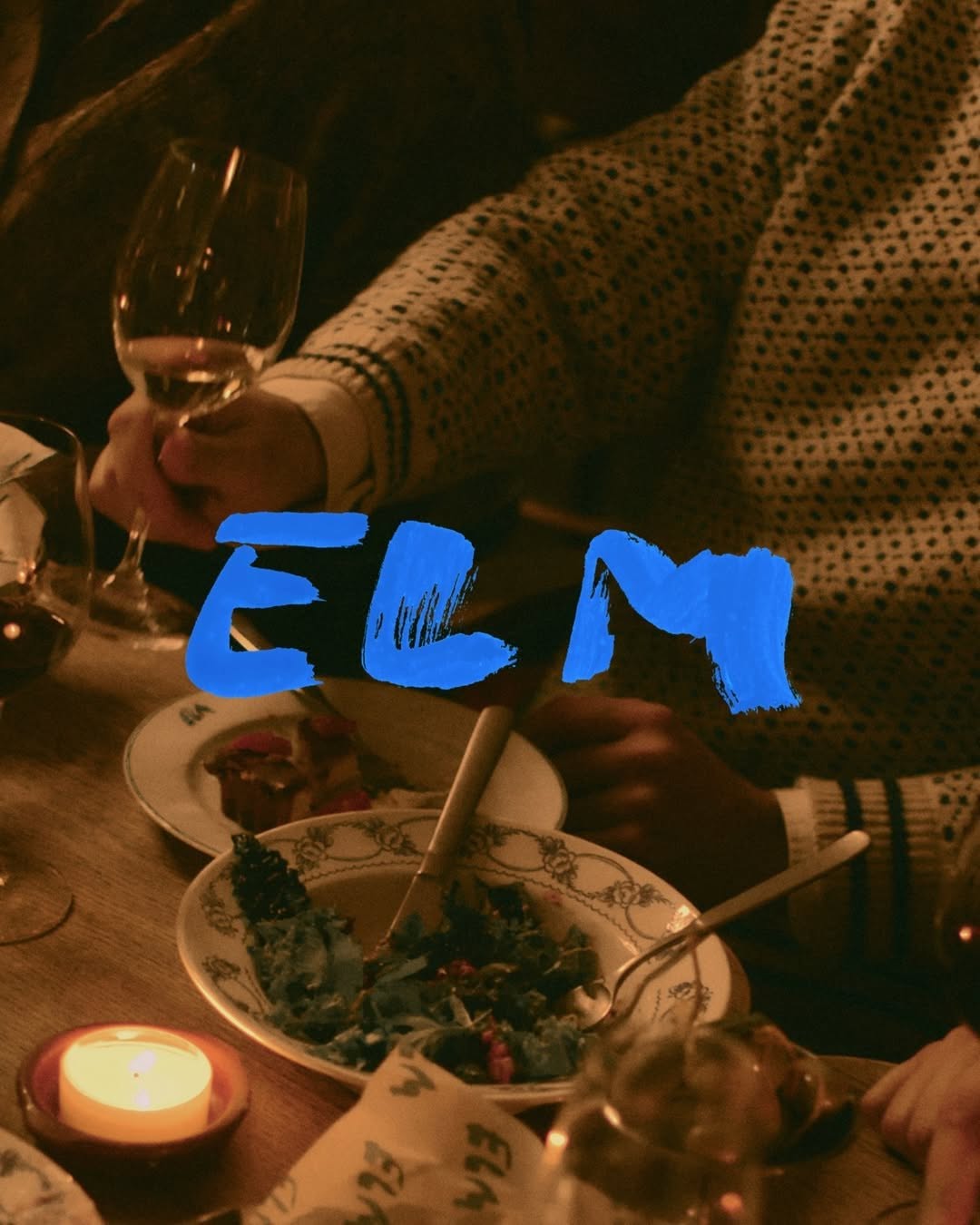
#architectural-scale-contrastbold intervention, traditional meets brutalist colour, high contrast
That thick, wet-brush cobalt blue heavily layered over the muted, snow-dusted timber facade creates immediate friction. The sheer scale and texture of the mark acts as a physical intervention, completely disregarding the architectural grid behind it.
The portable idea
Looking at how that raw, oversized brushstroke overpowers the heritage facade makes you rethink the need for subtlety. You do not always have to blend a brand into its surroundings to make it feel permanent. Sometimes the strongest move is an unapologetic, high-contrast mark scaled up until it becomes the environment.
May 22, 2026spotted via @welovebranding