
Brand crush
Bedrock
Identity by @thebrandidentity
#unexpected-editorial-utilityutilitarian hardware, quiet typography, tonal palette
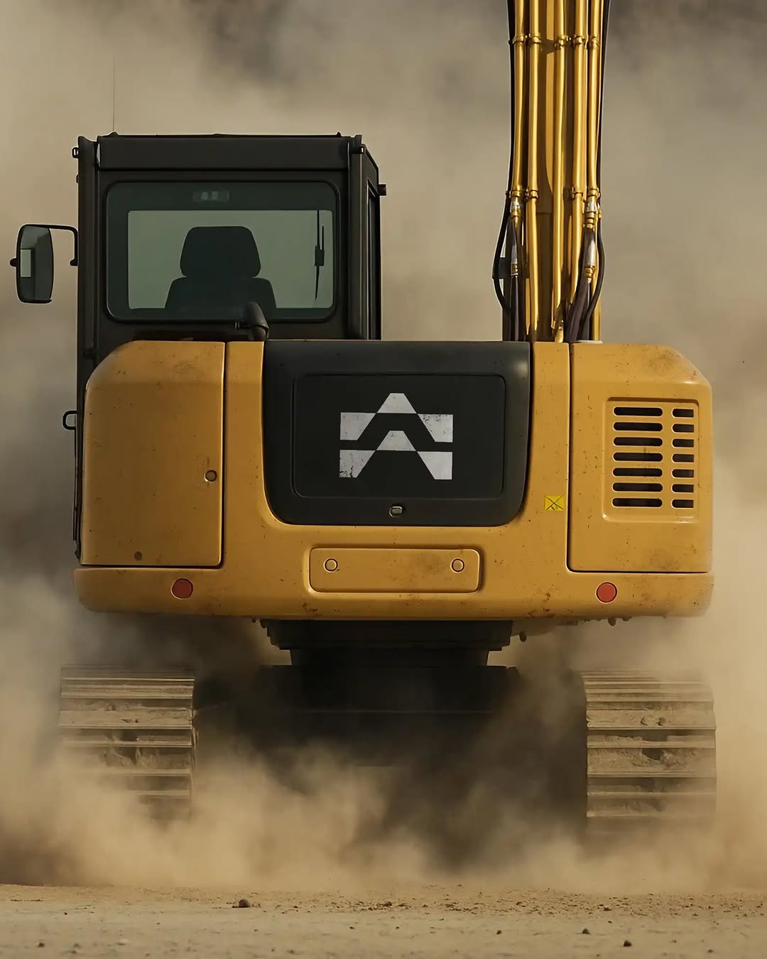
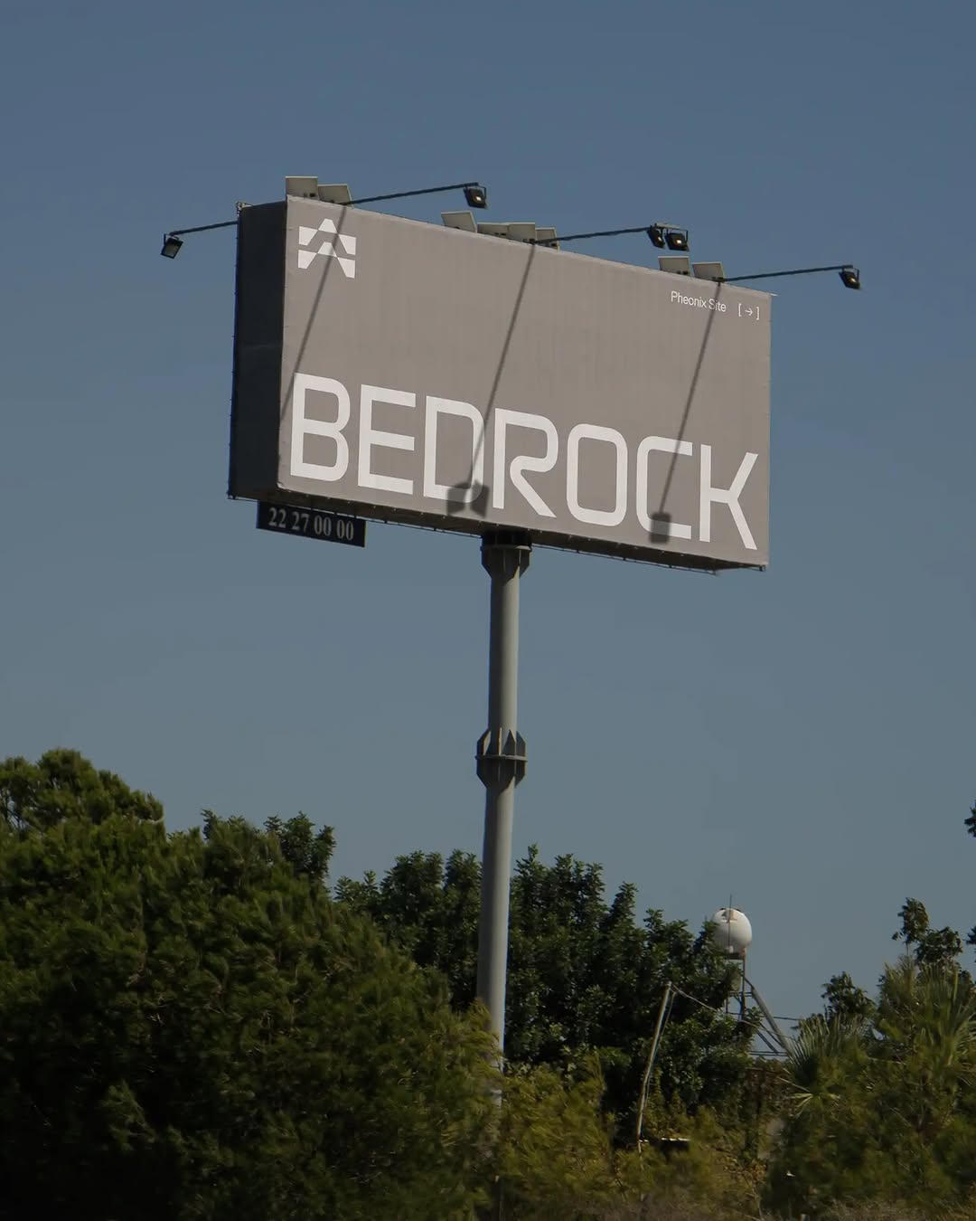
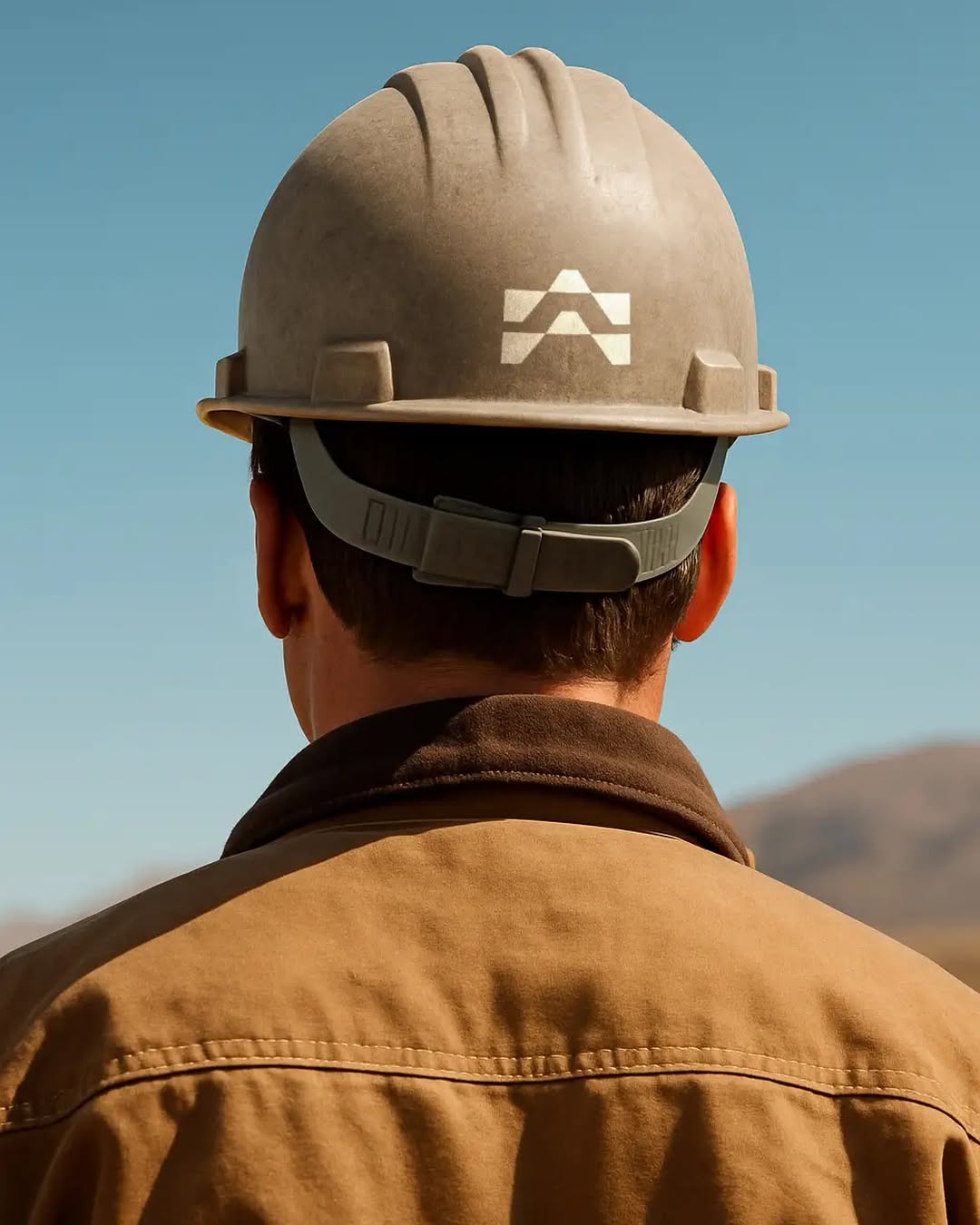
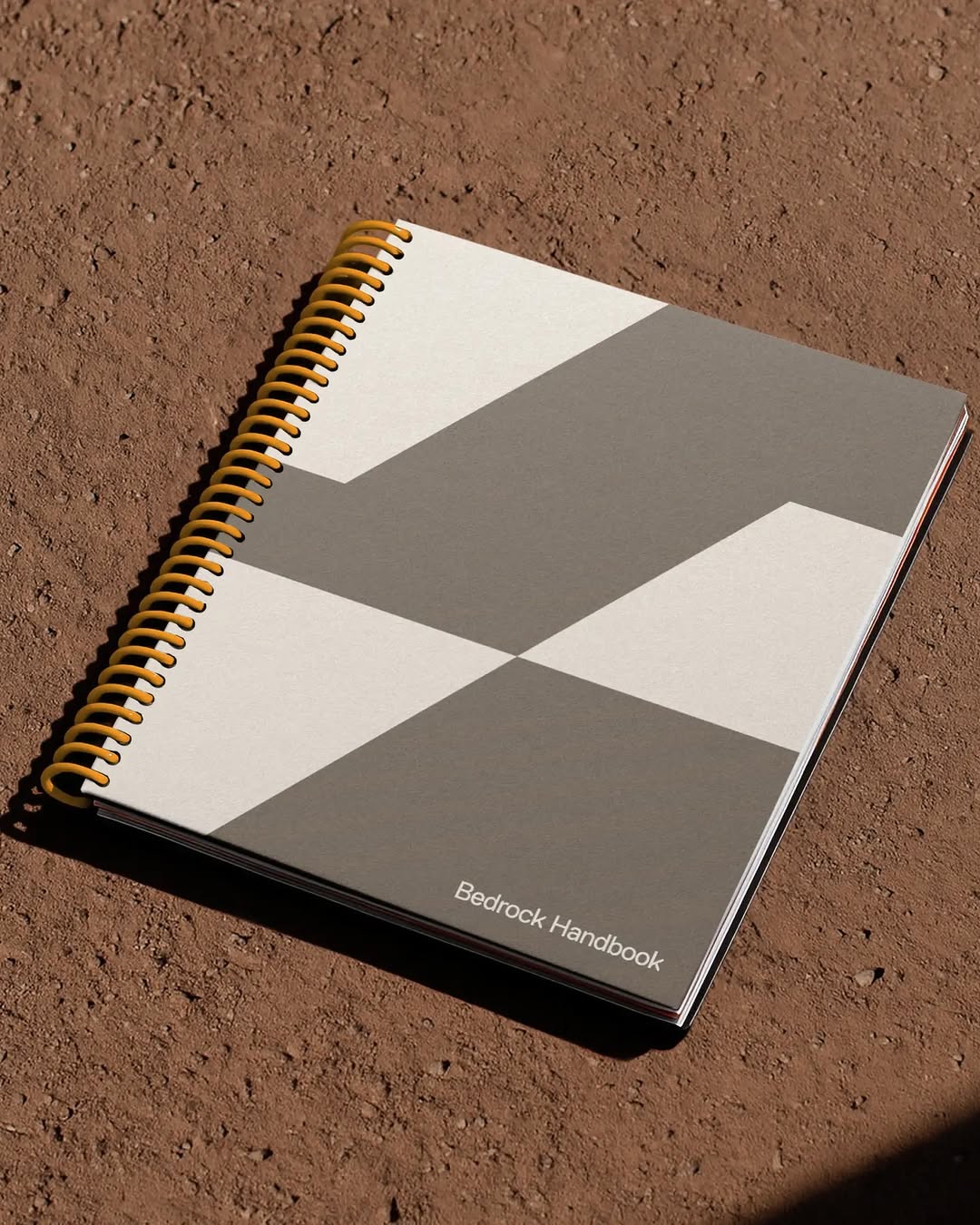
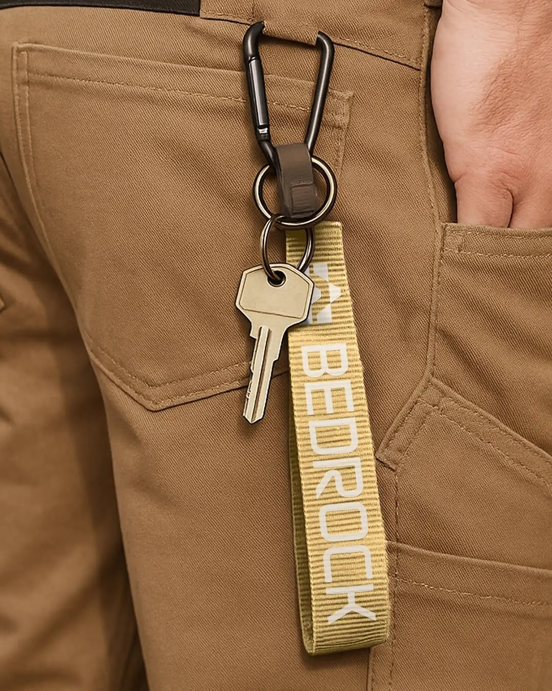
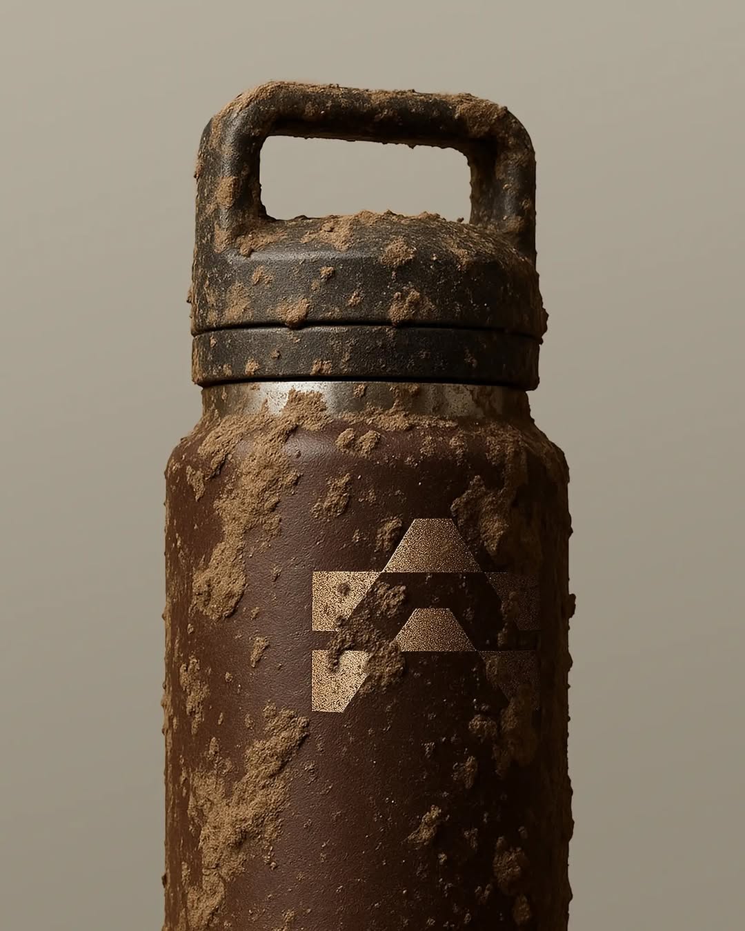
They have taken a rugged, utilitarian object and applied quiet, editorial typography to it. The heavy lifting is done by the contrast between the industrial hardware and the soft, tone-on-tone serif webbing.
The portable idea
You don't need loud colours to brand a tough object. Dropping a refined, well-spaced serif onto an everyday utility item creates a tension that makes people look twice. It turns standard equipment into a quiet statement.
May 20, 2026spotted via @thebrandidentity


